


- All posts
- anchoring
- architectural decor
- architectural furniture
- brand philosophy
- chairs
- color theory
- composition
- curation philosophy
- design character
- design manifesto
- design philosophy
- focal point
- furniture design
- grain texture
- grey
- human scale
- interior architecture
- interior commitment
- interior design
- Interior Moderna
- LED wall art
- light art
- lounge chairs
- material design
- modern art
- Modern Decor
- modern design
- natural materials
- neutral tones
- on-state off-state
- spatial design
- spatial logic
- strong form
- timeless interiors
- tonal design
- wall decor
- wall-mounted lighting
- wood wall art
The Chair as Architecture: Scale, Silhouette, and Vertical Presence
The article from Interior Moderna highlights a curated collection of modern living room chairs that blend comfort, style, and timeless aesthetics. It emphasizes how furniture, especially chairs, can elevate the personality and ambiance of a space. Interior Moderna offers a range of uniquely designed chairs from bold and colorful to minimalist and sculptural such as the Bold Chair, Egg Chair, Vanguard Lounge Chair, and Noodle Pipe Chair. Built with premium materials, these chairs not only enhance comfort but also act as statement pieces. The article also offers styling tips for incorporating these designs into various home settings, making it easy to transform any room with elegance and sophistication.
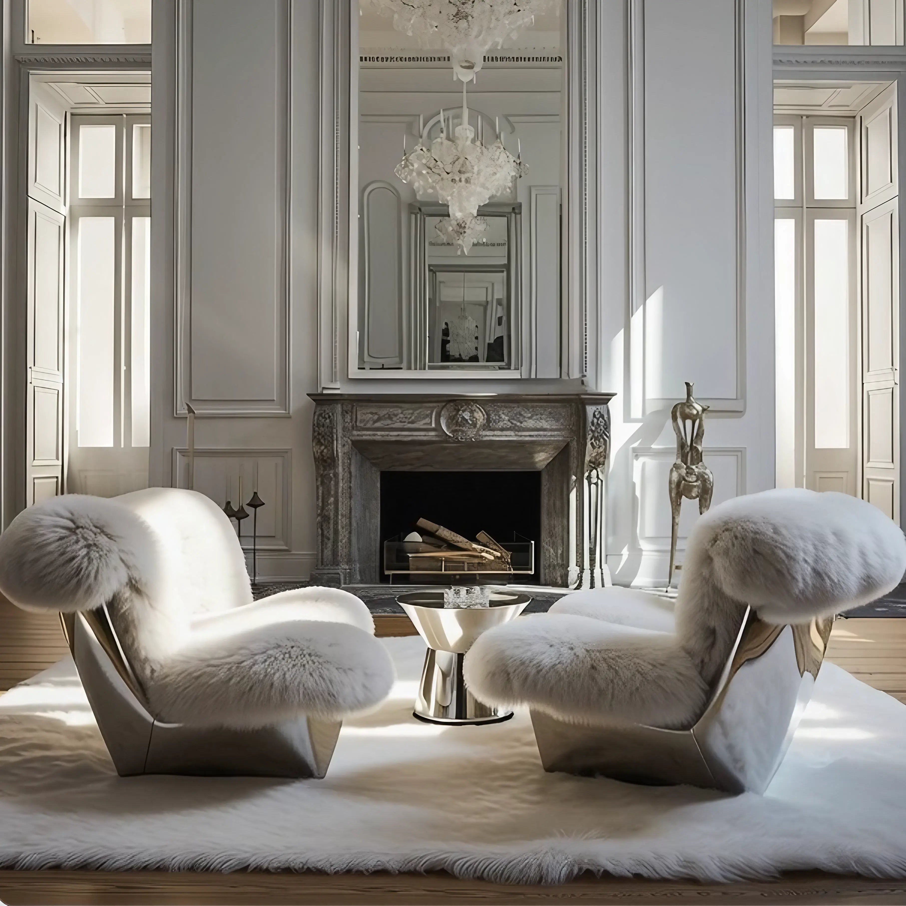
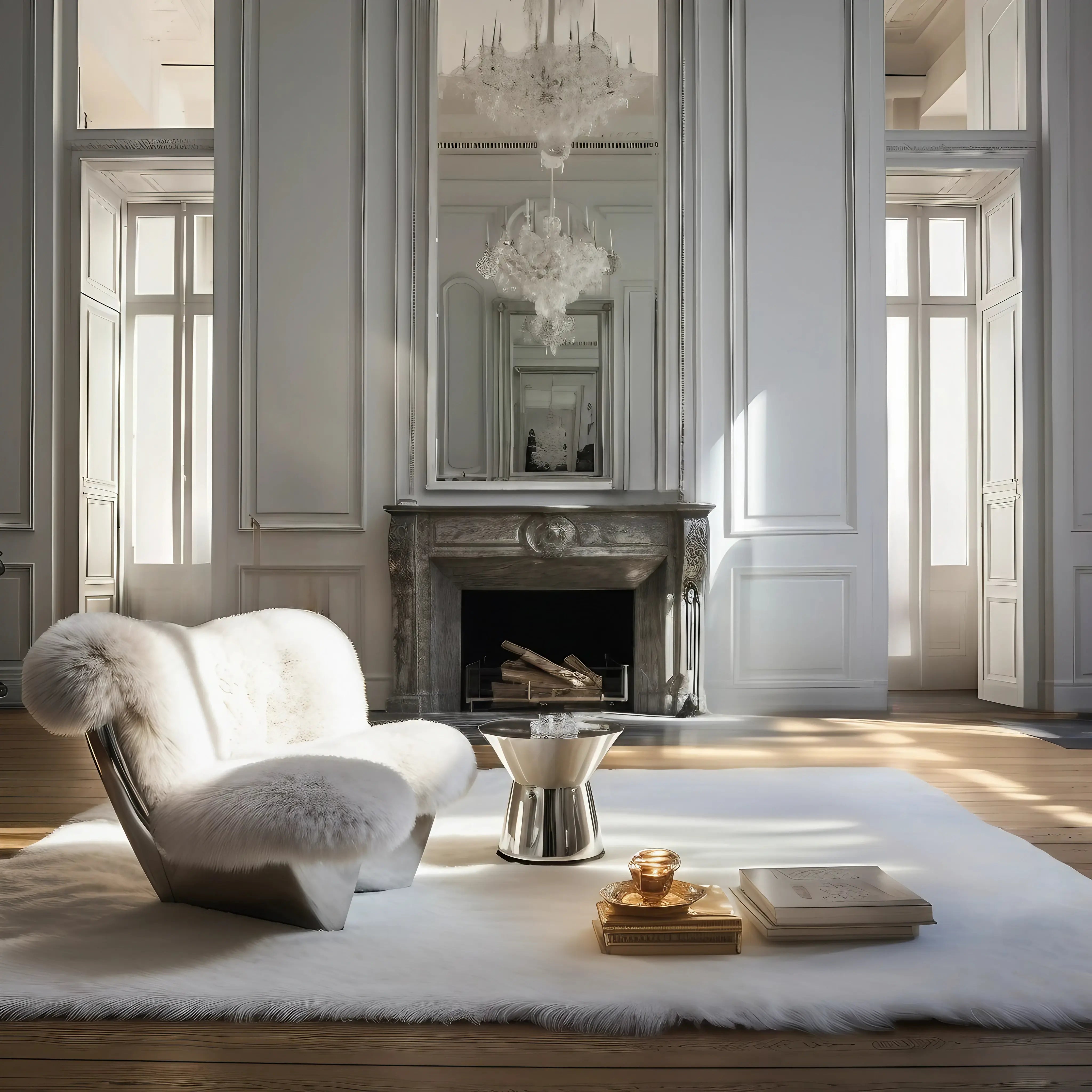
The Anchoring Object: Weight, Scale, and Compositional Center
Every considered room orbits a compositional center — a single object whose weight, scale, and surface specificity the eye finds first and returns to without effort.
On Grey: A Defence of the Most Misunderstood Color in Interiors
Grey is not a default. It is not the absence of a color decision or the safe middle ground between commitment and indifference. Grey is a position — a deliberate choice to occupy the tonal range where light and dark coexist without resolving into either. It is the most complex neutral available, and its complexity is precisely what makes it useful in rooms that require depth without drama.What Grey Does That White CannotWhite reflects light and amplifies it. A white room in direct sunlight can become blinding — every surface bouncing photons at full intensity, the room flattened by its own brightness. White erases shadow. It makes walls disappear by refusing to show the gradients that give surfaces depth. A white room in overcast light can feel cold, clinical, emptied of warmth.Grey accepts shadow. This is its fundamental advantage. A grey wall shows the gradient from a window's edge to the room's corner. It reveals the soft shadow cast by a shelf, the darker zone behind a lamp, the subtle variation between a surface in direct light and one in reflected light. Grey gives the room permission to have dimension — to be lighter here and darker there without the viewer registering those variations as flaws or dirt, as they might on a white wall.The Tonal RangeGrey is not one color. It is a continuum from near-white to near-black, and within that continuum exist hundreds of distinct positions, each with its own warmth, coolness, and character. A grey with blue undertones reads as cool and recessive — it pushes the wall back, creating apparent depth. A grey with brown or pink undertones reads as warm, advancing toward the viewer, making the room feel closer and more contained.Choosing a grey, then, is not a simple decision. It is a decision about temperature, depth, and the quality of light in the specific room where the grey will live. A north-facing room with cool natural light needs a warm grey to counteract the blue cast. A south-facing room with abundant warm light can sustain a cooler grey because the sun provides the warmth the wall does not. The grey is always in dialogue with the light, and that dialogue changes with every hour and every season.Grey as SophisticationThere is a reason grey dominates the palettes of architects, photographers, and gallery designers. It is the only neutral that possesses simultaneous depth and restraint. Black is deep but heavy. White is light but flat. Grey occupies the territory between them with a nuance that neither extreme can achieve. It provides enough surface presence to define a wall without enough intensity to dominate the room. It accepts colored objects placed against it without competing with their hue, acting as a ground that reveals rather than absorbs.To use grey well is to understand that it is not the easy choice. It is the choice that requires the most sensitivity to undertone, to light condition, to the materials that will share the room. A poorly chosen grey — one degree too blue, too green, too flat — makes a room feel dead. A well-chosen grey makes it feel considered, quiet, and endlessly deep. Grey is not neutral. It is the most demanding color decision in the room.